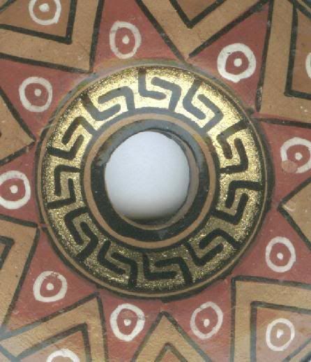
I’m trying to work on my images over at the Crafty Princess Etsy Shop, and at least with this new donut bead I put up recently, I think I’m getting a little better at it. Of course, this painted ceramic donut beads is so cool looking it made it easier than some items, but I tried to get various sections of the donut for the five images you are allowed to show for each item.
I struggle with trying to show shoppers what a piece looks like versus trying to show a really nice image that may not really provide as much visual information. So, for example, I’ve taken pictures with an item next to a penny or a ruler to give an idea of how large a bead or pendant is, but those just don’t look that great visually. And, after surfing around seeing what other Etsy shop owners are doing, I’ve noticed that not that many of them do that.
Someone recently described my shop as “a fun flea market,” and I have to say that is really not what I’m going for. Perhaps the flea market affect comes because of my hodge podge of merchandise? Maybe it’s because my images aren’t as artsy-fartys as they should be? I don’t know. I was trying to go for a “bead shop” feel, not a flea market feel. So, this comment concerns me.
I originally just thought I’d open up a shop on a whim, to clear out items that I continue to find as I reorganize my studio, but now I’m really starting to rethink my whole approach.
June 25, 2008 at 8:45 am
The photos of this bead are great!!! Try to re create this feel with your other pics. Folks on Etsy want a story, a little something extra. Great pictures sell. And great FIRST pictures get chosen to be in Treasuries which bring you more traffic. So the first picture, the one that shows up on your front page, should make the most impact – even if it doesn’t really show what, exactly, the item is. And of course – there’s no sense putting up an out of focus shot. The Red Tiger Eye Sand Dollar Pendant is a good example. The center picture should be your first picture and of course it needs to be a much sharper focus. The penny thing is not bad necessarily- it tells the story, but only one of that type of image and not much blank space around it. Etsy is a learning experience every day.
June 25, 2008 at 9:11 am
Thank you so much, Lora. I’m going to rearrange some of the images. I badly need to update my photo ability, so this gave me a kick in the butt to do it. My husband helped me with my last book, doing the photography, but he seems to “own” or camera now. So, I need to get my own set up.
June 26, 2008 at 11:13 am
The macro and auto focus features are my friends. My pics are almost always in focus and I just tweak the lighting and shadows a bit. They’re not submission quality, but they don’t need to be on etsy. The ones of my new rings on my blog were just taken under my ott lite with a piece of tracing paper scotch taped over the bulb right on my desktop. No tent or anything. i wouldn’t post those on Etsy, but I could.
Pingback: More artsy links!
Pingback: The Crafty Princess Diaries » Crafty Bloggers Unite 07/04/08
Pingback: The Crafty Princess Diaries » Craft Bloggers Unite 08/01/31